The Ukrainian Association of Professional Photographers’ microgrant program, implemented with the support of the International Press Institute, is an opportunity for Ukrainian documentarians to bring their ideas to life. In 2025, eight photographers joined the program and created their own projects — reflections, documents, and sensations of life during the full-scale Russian-Ukrainian war. The photo album “2025” is visual memory you can feel tangibly.
The DUO team of designers — Oleksandra and Mariia — worked on creating the “2025” magazine, which summarizes the results of the microgrant program for documentary photographers. The girls explained how they managed to unite such diverse projects into a cohesive story, which materials were the hardest to work with, and why, despite the date on the cover, the magazine will exist outside time.
A destructive method for creating something constructive
“We chose a magazine format because it’s comfortable to browse a publication of this size and easy to hold in your hands. It’s viewer-friendly,” — say DUO team designers Oleksandra and Mariia.
The magazine, created based on the results of the microgrant program for documentary photographers, includes eight projects by Ukrainian authors: Liza Bukreieva, Oleksandra Zborovska, Yana Kononova, Oleksandra Mahula, Slava Ratynskyi, Ania Tsaruk, Oleksii Chystotin, and Maks Chornyi. The designers managed to create a single visual code for the magazine that harmoniously united diverse projects about war, everyday life, loss, and resilience into one cohesive story.
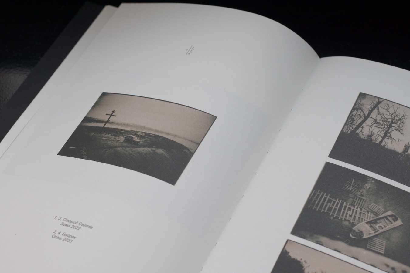
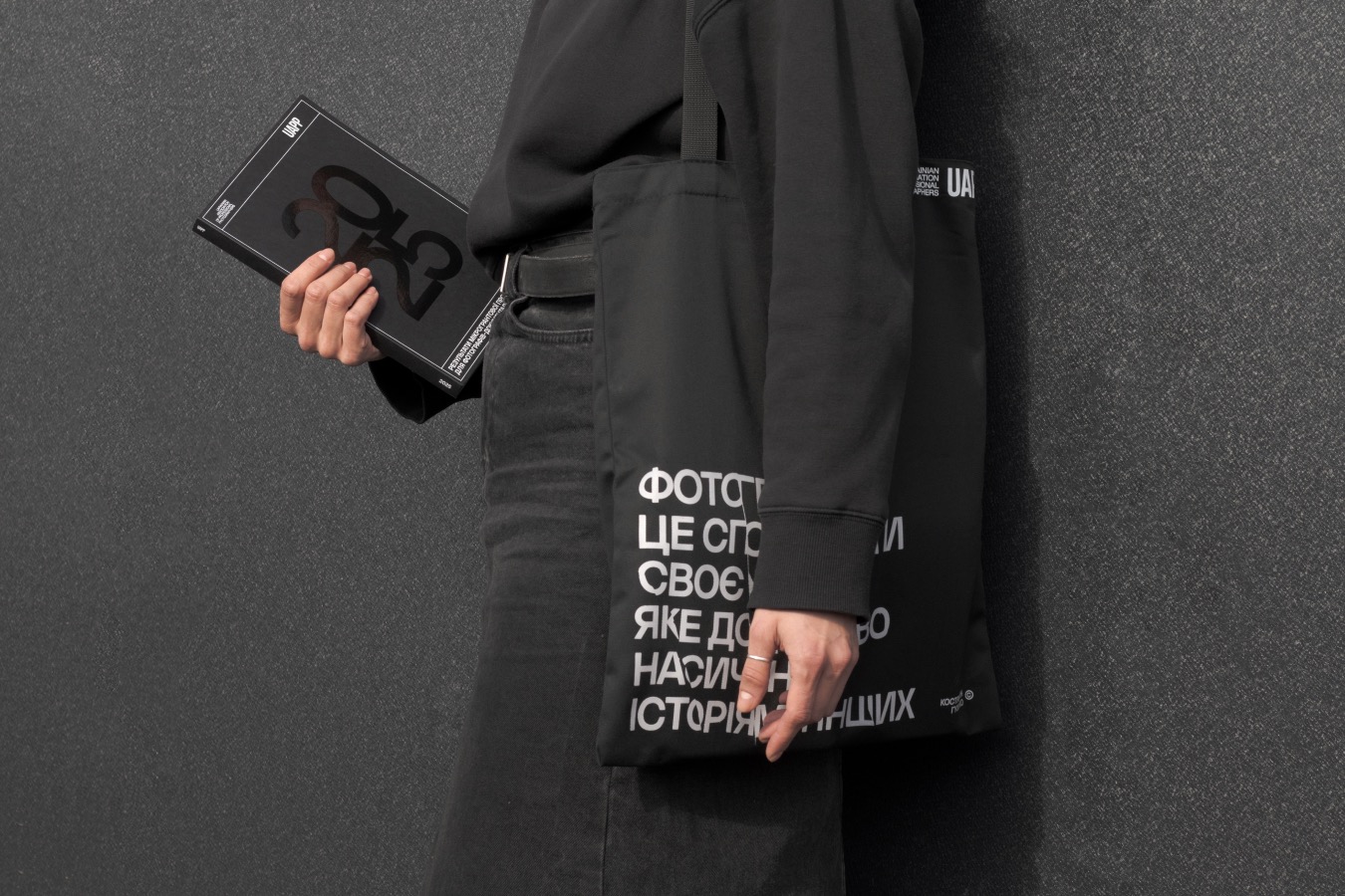
The designers analyzed the Ukrainian Association of Professional Photographers’ website and social media and created a cover in a corresponding style.
“We didn’t want to put a photograph by one of the authors on the cover, because that would have been unfair to the other photographers,” Oleksandra explains.
The cover of the magazine is black, and the year of publication — 2025 — is highlighted with a gloss varnish. The emphasis was placed on the year because the grant support programs for photographers will continue. Despite the date on the cover, the DUO team tried to make the magazine timeless, without relying on contemporary trends or design solutions that are popular right now.
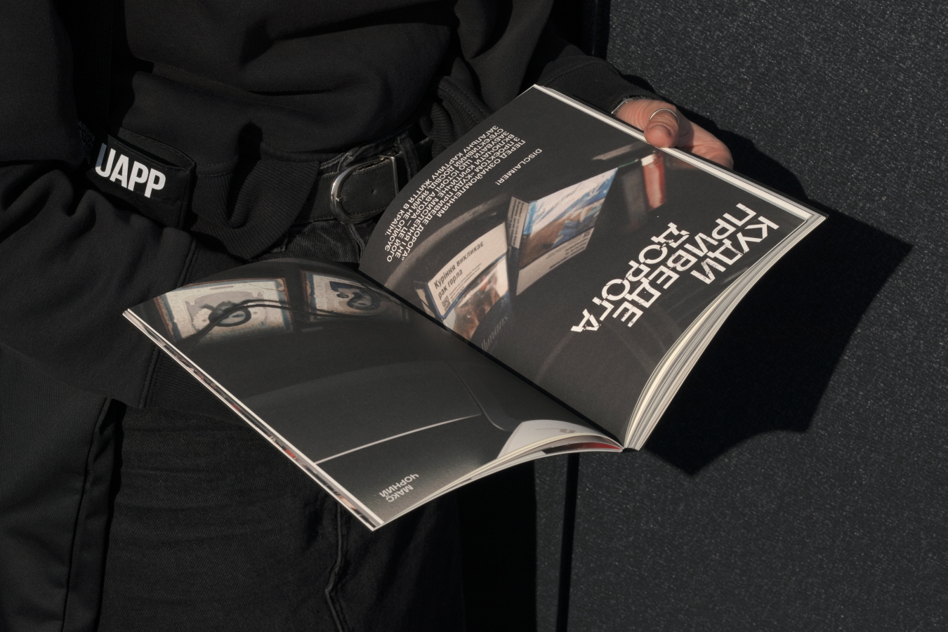
The projects in the magazine begin with a kind of poster — a photograph across a spread and the title.
“To make the publication feel special and handcrafted, we printed each project title on a separate sheet, then deliberately ‘destroyed’ it — crumpling and folding it. After that, we scanned the resulting lettering and overlaid it on the photograph,” Mariia says. “Of course, we could have done everything on a computer, but the result achieved with an analog method is always unexpected and interesting.”
Blank pages to be filled with meaning
While working on the magazine, Oleksandra and Mariia immersed themselves in the essence of each project. For all authors, they developed an individual layout that emphasizes the specifics of each project while maintaining the publication’s integrity.
“We perceived working with such a volume of material as film editing. Each spread is a cut of frames where neighboring photographs should reinforce one another,” the designers say.
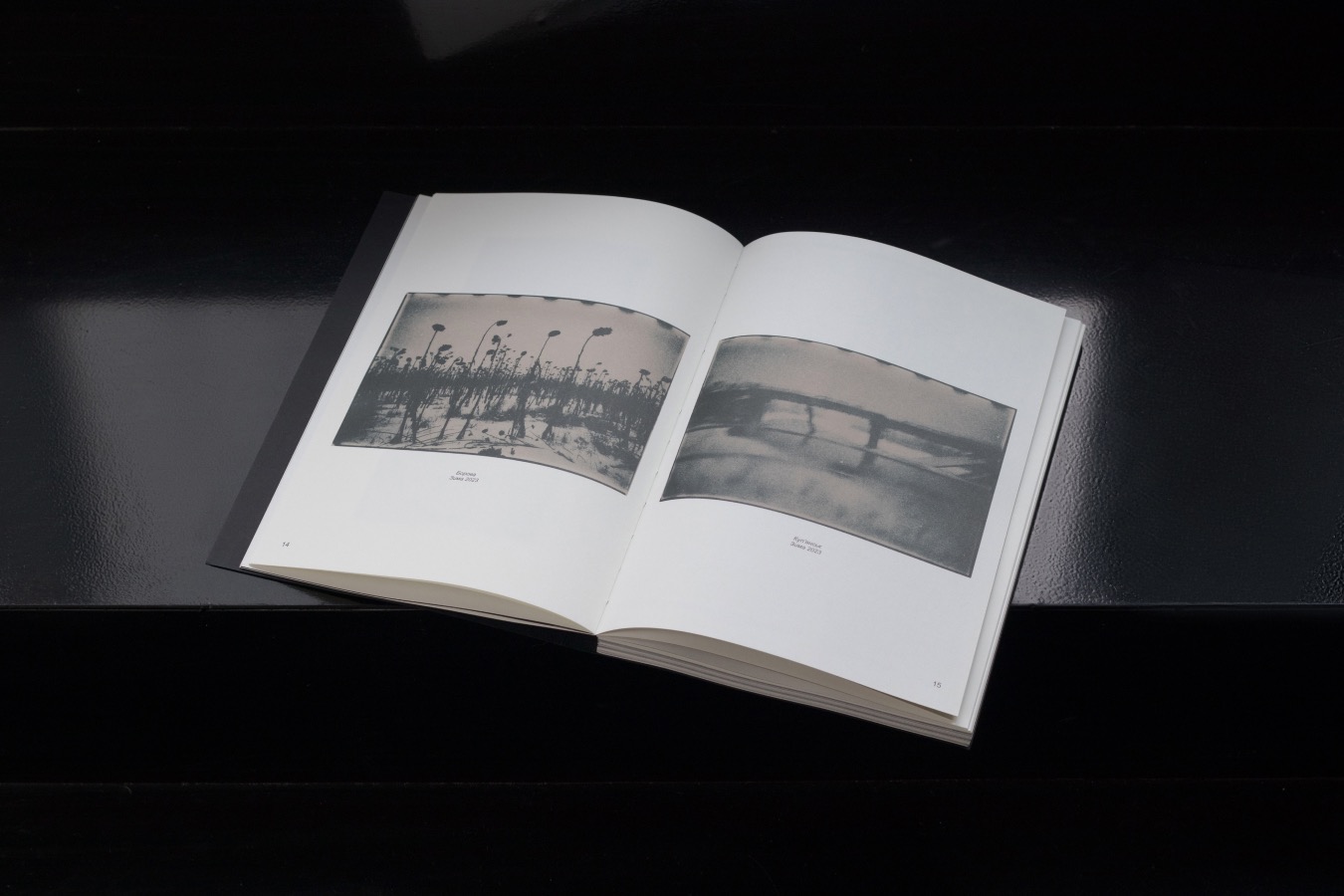
When working with projects that already had a clear structure, Oleksandra and Mariia preserved the author’s sequence, adapting it to the book’s size by selecting the most precise shots.
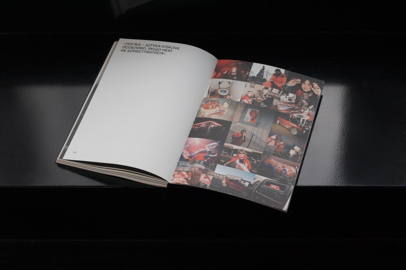
The DUO team left the combination of projects into the final sequence for the end. First, each story was assembled and laid out separately, and only after that did Oleksandra and Mariia look for its place within the overall structure.
“We knew from the start that the book should open with Oleksii Chystotin’s project. His photograph is a powerful introduction that literally invites the viewer to get acquainted with the magazine,” Oleksandra and Mariia say.
The designers worked on the magazine’s balance — both visual and semantic.
“We alternated projects that are lighter and darker in tone so that the pages could ‘breathe’. We also tried to balance them by content,” Oleksandra explains.
For example, in the stories by Oleksii Chystotin and Maks Chornyi, the recurring theme is the road, although they reveal it in completely different ways. Oleksandra and Mariia decided to separate these projects to give each one its own space to resonate.
Different experiences for a single story
A special stage in creating the magazine was a trip to a printing house in Kyiv. For hours, the designers chose paper by touch, studying each texture, until they found an option that seemed ideal. However, the first proof brought disappointment: the chosen paper turned out to be too textured — it literally “ate up” all the depth of color, especially black.
“Since we were personally responsible for this choice, realizing the mistake was unpleasant, but necessary. We had to urgently revisit the decision and look for other paper,” Mariia says. “At the prepress stage, Sasha had to make a lot of effort so that black wouldn’t collapse and would retain its saturation during printing. This experience taught us that tactile sensations from paper must always go hand in hand with its technical capabilities.”
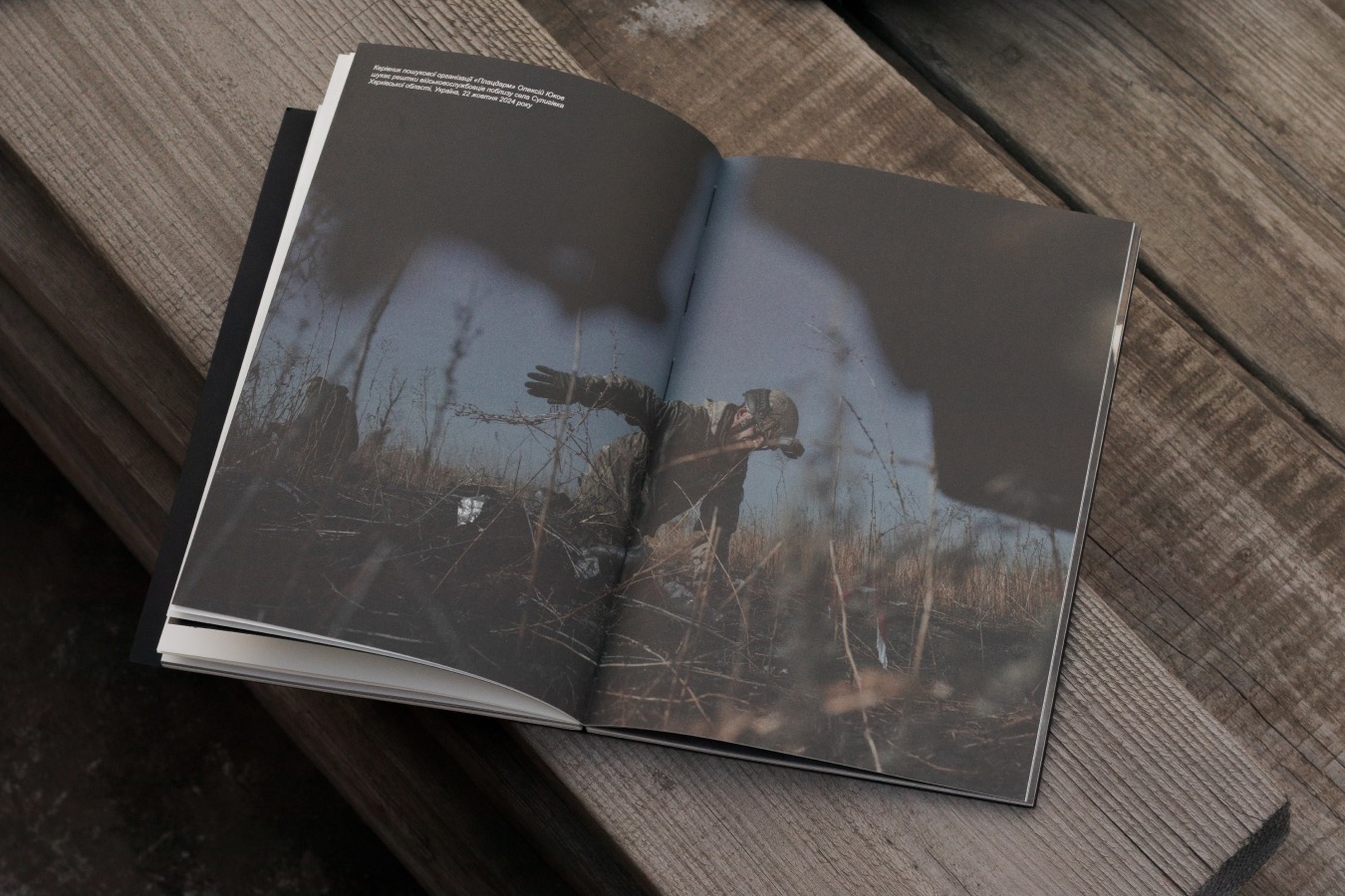
The projects included in the magazine tell about life during the war and are mostly emotional and difficult.
“The hardest for me was Liza Bukreieva’s project: every time I opened the layout, I wanted to cry. In the end, I handed it over to Oleksandra,” Mariia shares.
The girls also worked for a long time on Oleksandra Zborovska’s material “I Will Return”. It is the story of artist Daria, who survived the occupation in Kyiv region and is a survivor of sexual violence committed by Russian soldiers.
“Beyond the emotional component, the challenge of the project lay in its incredible eclecticism: film, digital, black‑and‑white frames, and Daria’s drawings. All of this had to be woven into a single narrative,” Maria says. “We went through four different layout iterations before settling on the final version.”
The main design task for the magazine was to find a balance—to avoid overdoing the styling, while also not making it boring.
“It was important for us to treat every story and every photograph in it with respect—to not cut into the composition, not crop the frame, and to give each image space to be perceived,” Oleksandra and Mariia say. “A separate challenge for us was the separators—technical and visual elements that divide photos and text. We looked for a form for them that would read on an emotional level and wouldn’t be too straightforward. It was work with many challenges, but it was very interesting for us.”
DUO team is a creative design duo—Oleksandra and Mariia—based in Ukraine. The team specializes in graphic design and visual identity, combining different visual approaches into cohesive, expressive projects.
This material was created with the support of the British Council program “Creative Economy Grants.”
Credits:
Researcher, text author: Katia Moskaliuk
Photo editor: Olha Kovalova
Literary editor: Yuliia Futei